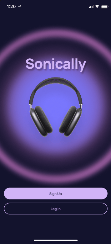
Sonically
End to end mobile app
A mobile music streaming app that provides users with curated playlists based on user context.
Role
Sole UX/UI designer
Tools
Figma
Figjam
Google Suite
Duration
80hours
Problem
Music listeners struggle to find what to listen to based on their current situation or mood, leading to indecision and frustration when it comes to music selection.
Opportunity
How might we provide an effortless way for users to find music that complements their mood or activity, resulting in an enjoyable, frustration-free experience?
Based on initial interviews, I found that I was not alone with frustrations of music discovery. Talking to 4 avid music listeners aged 29-32 I found that they were indecisive and didn’t know where to start when they want to listen to something new or don’t know what they’re in the mood to listen to. Additional frustrations included not being able to share music within their chosen streaming apps and repetitive or weak song recommendations.
The Solution
Inspiration & Background
A product that addresses these issues of overwhelm and indecision when it comes to music discovery with features that let the users choose relevant and contextual suggestions with ease.
Personally, sometimes I have difficulty figuring out what I want to listen to or the streaming app that I use gives me irrelevant or repetitive suggestions and then I have to put in the work of finding songs on my own and putting them in a playlist. The infinite amount of music also makes it difficult for me choose, leading me to listen to the same music over and over. Which is probably why I have the same music taste I did as a middle schooler.
I thought of music streaming apps I currently use and have used in the past. The ones I felt that have been the most successful in helping me discover music easily didn’t give me the option of selecting my own music and instead suggested playlists. The main inspirations for this being Pandora and Songza, a now obsolete app that provided users with ready-made playlists tailored to user preferences and activities. Songza is an app I look back fondly on and working on Sonically is how I could revisit it in my own way. In this project, my goal was to merge my design skill and love for music, creating a seamless and delightful music discovery experience and making the listening journey more personalized and joyful for the user.
DISCOVERGoals
Identify any challenges or pain points users face with their current music streaming experience.
Explore how users currently discover new music in different contexts.
Understand users’ music listening and sharing habits, including whether they actively search for new songs or prefer recommendations.
Assess how effective curated playlists are in meeting user expectations and the degree of personalization users desire.
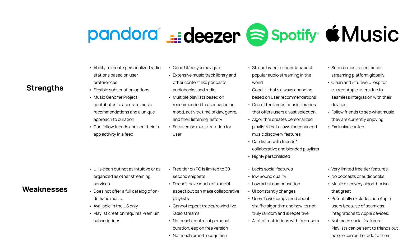
Analyze strengths and weaknesses of closest competitors and determine if there are gaps that could be addressed.
Interview Insights
Competitive Research
User Personas
Pain Points
4/4 participants don’t have a way to share music within their chosen streaming apps
4/4 don’t know where to start when they want to listen to something new or don’t know what they’re in the mood to listen to
3/4 found it time-consuming to create personalized playlists for different occasions or moods.
3/4 found music recommendations by an app to be a hit or miss
2/4 find music suggestions to be repetitive sometimes
Listening Behaviors
All listen to music frequently, often throughout the day, and for various purposes, including background noise, studying, gaming, and socializing.
Users often share music recommendations with friends and family to connect, share their interests, and expand their music libraries.
4/4 prefer getting music recommendations from their chosen apps rather than friends/family or other methods because they are easily accessible and most accurate.
3/4 use Spotify and enjoy it because of the UI and convenience. All of them use curated playlists to find new music or put on when they don’t know what to listen to
4/4 value similar genre and mood when it comes to personalized music recommendations
4/4 listen to music based on what they are doing or their mood
4/4 like to share music with others to connect with them
Likes/Would like
Being able to reset a playlist or refresh playlist options
How spotify adapts to a users’ music taste at different times of the day
Likes having the option of seeing other users’ playlists when she has exhausted suggested playlists
All of the competitors I looked at had playlists curated or tailored for users in some way, but not all of them had in app sharing or social features. Pandora and Deezer’s way of presenting music to the user is through playlist or radio-like form and do not offer the full catalog of music. Though they allow the user to choose a playlist and listen passively, the experience they offer may not fully address the indecision users face when they don’t know what to listen to. Offering them specific contexts can allow them to choose quickly and with ease.

Methods
Competitive analysis
User personas
User interviews
DEFINESitemap

User Flows
In addition to a standard sign up/log in flow, I focused on 2 key user flows that showcase the users’ ability to choose a playlist from suggested and browse playlists in category subsections.

Based on initial interviews, I created a user flow for a feature that provides the user with suggested contexts (moods, activities, etc.) upon application open that leads to a set of suggested playlists. Since all participants expressed some discontent or frustration with not knowing what to listen to at certain times, giving them a small amount of playlists at a time simplifies decision-making and makes it less overwhelming to just put something on and go.

Users also expressed that sometimes music recommendations can get repetitive. If they feel that the contexts or playlists that are provided to them aren’t what they need at the time, the browse feature allows them to look for something more specific.
DEVELOPMid Fidelity Wireframes
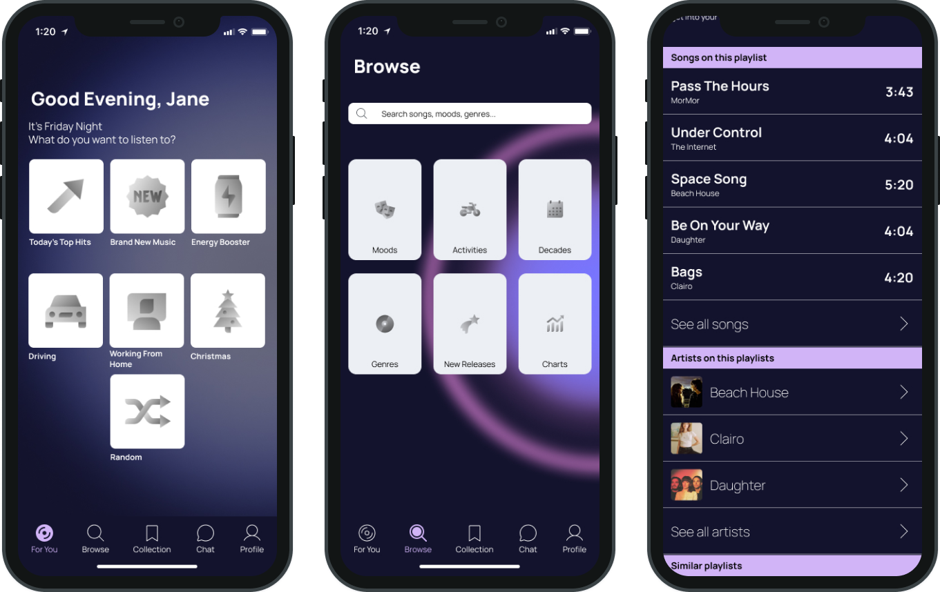
Using inspiration from direct competitors such as Spotify and Songza (retrospectively) I translated some of my initial sketches to low fidelity wireframes using Figma. I wanted to make sure to design screens that are familiar to users’ current music streaming app experiences for easy learnability and reduced frustration. Shown here are some main screens that users will interact with in Sonically. From left to right: Main screen on opening, Subgenre search screen, and playlist detail screen.
Moodboard & Inspiration
I was excited to start developing this app but lacked a clear vision when it came to its aesthetics and the ambiance I wanted it to exude. What helped was brainstorming words that reminded me of “predicting” or “anticipating” something.

Design

UI Inspiration was taken from Spotify Daylist to indicate change of playlist suggestions 3 times a day. The user would be able to get notifications when updated. I chose to keep the gradients going throughout the app for consistency and to keep that “mystical” feel.

UI Kit
“The premise of Daylist is that it updates multiple times a day (six times to be precise). For each of these stages, Spotify defined illustrative gradient backgrounds resembling the sky. We expanded on these visually and used them as the story vehicle.”


High Fidelity Wireframes
DELIVERTesting

Significant Insights
Iterations
I tested out 3 different flows with 5 participants aged 23-35. The flows included: A standard sign up flow, choosing a playlist from recommendations, and browsing for a playlist.
Objectives
Evaluate how intuitive the process is for users to find and select a playlist based on user context on their For You page.
Evaluate the experience of browsing categories of playlists and choosing.
Assess whether the UI is pleasant and content is understandable.
Identify areas of improvement during any part of task execution, overall UI, and content.
Sign Up screens
Sonically collects some basic user information including favorite music artists to quickly create an account and start listening to music tailored to their tastes.
Choose a Playlist from Recommendations
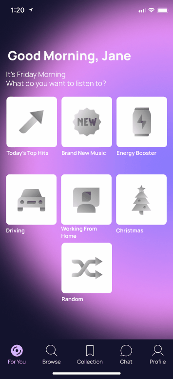
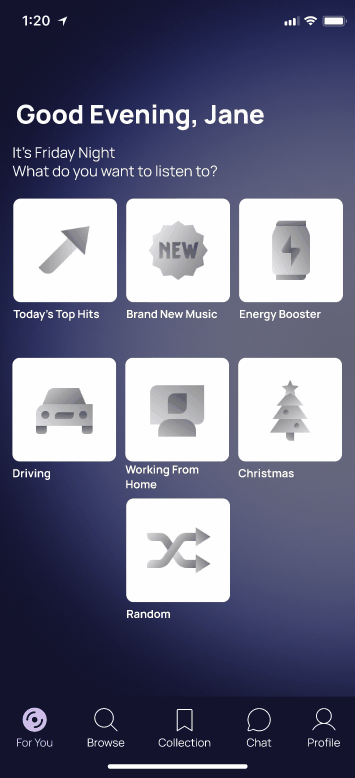
On opening the app, users are presented their “for you page” or recommendations page that lists a variety of scenarios.
Users can then select the scenario that best matches their current situation or mood from the provided options.
Based on selection, Sonically offers a few playlists suited to that context. The recommended playlists offers a brief description to help the user choose the one that resonates with them the most and start listening.
Browse Other Playlists
In the browse feature, users are provided with a range of categories and filters to narrow down their options, but also have the ability to search for a specific context.
In this example flow, the user chooses the mood category and is immediately taken to a screen that suggests multiple playlists of different moods. If none of the moods resonate with the user at the time, they also have the ability to see all moods or search for a specific one. The user chooses “calm” and is taken to the screen that shows all of the Calm mood playlists. From there, the user can select a playlist and get more information on the playlist detail page and can start it.
Most users expected to see a list of songs on the playlist page. They thought that the suggested playlists would be at the very bottom after a song list.
A user felt that asking for permission to access contacts is too early on in the sign up process and would theoretically feel more comfortable if he was prompted later or at a different time
User’s initial instinct is to scroll through suggested playlists first and then go to see all moods if they can’t find what they are looking for. Users could not find see all mood CTA.
Make hierarchy more consistent with clear font headings
When choosing liked artists during the sign up process, adding a ‘next’ button when all preferred artists are selected could make it clearer to the user that they are done with selection instead of automatically going to the next screen.
All testers gave overall positive feedback of UI and understood the concept and stated they would use the app frequently if it was real.


CONCLUSIONNext steps
What I Would Have Done Differently
What I learned
Conducting a second round of usability testing to see if the iterations made the app more intuitive
Focus on the social aspect of the app since that was another problem that music listener’s faced with the current apps they use.
Add a short, engaging survey or questionnaire at sign up to further gauge how the user is currently feeling or their usual activities so that suggestions are even more tailored to the user and their listening habits.
During this project, I think I spent too much time on UI design and trying to get it “perfect” immediately instead of iterating a few times, the way that design is set up to be. Throughout these projects, I think that letting users test a mid fidelity prototype before going all in on a high fidelity prototype would have been very useful. Getting some feedback on the design and functionality of a certain feature would have made me more confident with the design choices made instead of going into a usability test “blind” (ie. no input from potential users at another time besides the research phase until testing).
Instead of focusing on a sign up flow, I wish I had spent time developing a social feature that made sharing music fun and easy within the app since interview participants expressed that they currently don’t have a way to share music directly within their chosen streaming app and frequently share music with their friends and loved ones for connection.
Overall, even though I feel like I spent more time than needed on UI, I satisfied with the result which was reinforced by positive feedback from testers at the end.
Iteration is necessary to save time and quickly refine designs so that it doesn’t feel so labor intensive at the “end” (using end loosely because design will always change) of a project when priority revisions need to be made.
An MVP is exactly what it means “minimum viable” and doesn’t have to be perfect or fully fleshed out, even though my perfectionist/completionist nature believes it has to be. For this project, I think the most unique feature is the recommended playlist page but I still feel like there needs to be something else that’s new and exciting for this app to stand out against the competition. However, I know that design convergence is what will attract users and having too many unique features can deter them due to unfamiliarity. There is a fine balance between innovation and user familiarity in product development.
I had fun working on a project on a subject I love and enjoyed improving my UI design proficiency.